


Here is a scene that has played out in thousands of organizations over the past two years.
An AI program lead walks into a quarterly business review with a slide deck. The deck is full of good news. Adoption is up. Training completion rates are strong. The vendor dashboard shows daily active users climbing week over week. There is a bar chart. The bar chart goes up.
The CFO looks at it for about 45 seconds and asks: “What did this change about how we work?”
Silence.
Then: “What did we actually get for the $800,000?”
More silence.
The program lead has dozens of data points. None of them answer that question.

This is not a rare situation. It is the situation. The 88%/5% gap that researchers keep documenting — 88% of organizations reporting AI use in at least one function, 5% of pilots materially accelerating revenue — is not a technology failure. It is a measurement failure dressed up as a deployment success.
The bar chart goes up. The P&L doesn’t move. And nobody in the room can explain why, because nobody built the measurement architecture to answer the question.
This is the guide for fixing that. Practically. Before your next board review.
The question the board is actually asking
When a board or executive team reviews an AI investment, they are not asking whether employees like the tool. They are asking two things:
Did the unit economics change?
Can you prove it?
Unit economics means: what does it cost to produce a unit of work, and did AI make that number go down? That might be cost per support ticket resolved, cost per proposal generated, cost per code review completed, cost per hour of analysis delivered. The specific unit depends on the function. The question is always the same.
“Can you prove it” is where most programs fall apart. Because proving it requires something most organizations skip: a documented baseline captured before the rollout, a pre-defined methodology for comparing against it, and a formula that finance can audit line by line.
Without the baseline, you have a story. Finance does not fund stories.
What makes a number defensible?
A defensible metric has three properties. This sounds obvious until you try to build one.

It is pre-defined. The metric was agreed on before anyone could see the results. This is the single most important property. When you define success metrics after you can already see how the rollout went, both sides have an incentive to interpret “success” favorably. The fix is structural: define the metrics before the work starts, in writing, with both sides clear on what the formula is and what the baseline is.
It is formula-based. The same calculation applied consistently across the measurement period. “We felt like people were saving time” is not a formula. “Time per eligible task type measured via system logs, averaged across the team, compared to the pre-rollout baseline of the same task type” is a formula.
It is traceable. You can show where the number came from, one step at a time. If someone asks “how did you get to $336,000 in reclaimed labor value,” you can walk them through the exact calculation: here is the task count, here is the time-per-task delta, here is the loaded hourly rate, here is the formula. Each line traces to a source.
A number without all three is an estimate. Estimates are fine for internal planning. They are not sufficient for a board review.
The four metrics that hold up in a business review
Different organizations use different terminology, but the metrics that reliably survive finance scrutiny fall into four categories.
Time reclaimed per employee. Not hours logged in the AI tool. Hours of productive work completed faster than the pre-rollout baseline, for the same output. The evidence benchmarks here are well-established: median recovery of about 6.4 hours per week per seat when AI is genuinely embedded in workflows, with customer service roles recovering 8-9 hours, developers 6-8 hours, and knowledge workers broadly around 5-6 hours. Senior leaders typically see the smallest raw time savings (2-3 hours per week) but the highest dollar value per hour.
A critical adjustment to make before presenting this number: subtract the rework factor. Research shows roughly 37% of time saved by AI is spent correcting or validating AI outputs. Net hours reclaimed is the number that survives scrutiny, not gross hours saved.
Cost per hour reclaimed. This is where you translate time into money in a way finance accepts. The formula: take the employee’s base salary, multiply by 1.4 to get the fully-loaded rate (taxes, benefits, overhead), divide by 2,080 productive hours per year. That’s the loaded hourly cost. Multiply by net hours reclaimed. That’s the dollar value of what you recovered.
For a team of 100 knowledge workers at an average loaded hourly cost of $80, recovering 3 net hours per week per person produces $1.25 million in recovered labor value annually. Set that against your license and implementation costs and you have a number the CFO can work with.
Adoption rate trajectory. Not a snapshot number — a trend. The benchmark that holds up in business reviews: above 60% monthly active use at 90 days is healthy; below 40% at the same point signals structural problems that training alone will not fix. The trajectory matters as much as the current figure, because boards want to know whether this is still moving or has plateaued.
Note: “active use” means something specific here. It does not mean logging in. It means the tool was used in completing an eligible work task during the period. Defining “eligible work task” is the measurement decision that makes this metric defensible or not.
Before-and-after productivity comparison. The most compelling presentation and the hardest to do rigorously. This requires: a documented baseline from before the rollout (captured during the diagnostic phase, not reconstructed afterward), a consistent unit of output to compare (tickets resolved, drafts produced, reports completed, analysis cycles run), and a measurement design that accounts for what else changed in the same period.
Rigorous before-and-after comparisons use either a control group (some teams without AI access, some with, compared over the same period) or staggered deployment (teams brought on in waves, with earlier waves compared against later waves during the transition). Both are more credible than a simple “this is how long it took before, this is how long it takes now” with no controls.
The 90-day window and why it matters
Boards and CFOs reviewing AI investments want to see results organized across three time horizons, because the metrics that are meaningful differ depending on when you’re measuring.
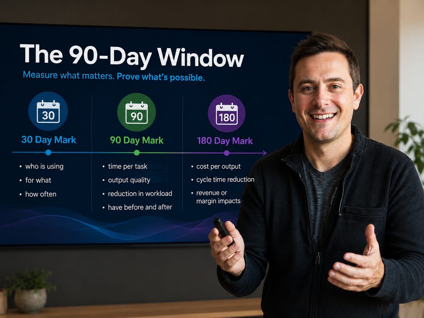
In the first 30 days, the relevant data is engagement: who is using the tool, how often, and for what task types. This tells you whether the rollout is reaching the right people. It does not tell you whether it’s working.
At 60-90 days, performance metrics become measurable: time-per-task, output quality, reduction in revision cycles. This is where a rigorous before-and-after comparison starts to be meaningful, because you have enough data to separate novelty behavior from actual workflow change.
At 90-180 days, business impact metrics start to appear: changes to cost-per-output, cycle time reduction, and in some cases revenue or margin effects. These are the metrics that belong in a board deck. Presenting them at week four is guessing with a chart behind it.
The 90-day mark is also a useful diagnostic. If adoption is still below 40% at that point, something structural is broken. The question is which variable: workflow redesign (the tool isn’t embedded in how work actually happens), manager behavior (leaders aren’t modeling or reinforcing the new approach), or cue installation (the signal to use the tool at the right moment isn’t present). Each has a different fix.
The board-ready one-pager
One page. This is not a stylistic choice. Boards have more information competing for their attention than they can process. A concise summary that leads with the conclusion forces clarity that sprawling appendices hide.
The structure that works, in order:
The result. One sentence. The headline number with a dollar sign or a percentage or both. “AI reclaimed 4,200 productive hours in Q1 at a net value of $336,000 against $180,000 in license and implementation costs.”
The context. Two to three sentences. What was the rollout, which team or function, over what period.
The methodology. Three to five sentences. How you measured, what your baseline was, what the formula is, what counts as an eligible event. This is what makes the result defensible rather than claimed.
The comparison. The before-and-after. Specific numbers, same unit of measure, same time window.
The next step. One sentence. What you’re recommending or requesting based on the result.
Everything on the page serves one of those five sections. If a data point doesn’t serve any of them, it belongs in an appendix you didn’t print.
The reason most rollouts can’t generate this
Most AI rollouts are not designed with measurement in mind from the start. The diagnostic work that would capture baselines doesn’t happen. The pre-defined measurement protocol doesn’t exist. The eligible work events are never defined.
So at the 90-day mark, or the board review, or the budget renewal conversation, the program team is left with log-in counts and training completion rates and a vendor dashboard that shows very exciting graph shapes. None of which answer the question the CFO is actually asking.
Building the metrics that hold up requires a specific sequence: baseline first, redesign second, measure third. Organizations that invert this — deploying first, then trying to reconstruct what “success” means afterward — almost never produce defensible numbers. They produce stories.
The programs that generate documented, verifiable results are the ones where the measurement architecture is designed before the rollout begins. Not because that is harder. Because that is the only order in which it works.
The good news: 90 days is enough time to do this right. It is also, not coincidentally, the window that produces results defensible enough to put in a deck.
If you are sitting in that room where the bar chart goes up and the CFO goes quiet, this is what was missing. Not the bar chart. The formula behind it.
Subscribe for more from the field on AI adoption and the gap between deployment and actual results: lab.workredesigned.co